

PRINCIPAL UI / UX DESIGNER
UI / UX DESIGN | BRANDING
AUG 2021 – FEB 2022
Buddio
Buddio is a mood-tracking and behavioral science-based mental health app. As the solo UI / UX Designer at this startup, I transformed the UX by streamlining user flows and designing delightful user interfaces for various product features.
The Solution
I dove deep into this role by conducting in-depth dogfooding exercises, user interviews and competitor analyses to identify pain points and what we were missing. For each product feature, I ideated, wireframed and prototyped several solutions for the team to test and implement.
The Opportunity
As a startup in the healthcare space, the tiny Buddio team of 3 was constantly iterating its product features but was struggling to find Product-Market Fit and grow its user base. They needed a solid process to conduct research, collect data and design these features better.
“Why are users quitting the app before even beginning?”
One of the first data points I encountered as the UX Lead was that Buddio’s exit rate during user onboarding was too high.
In order to find out why this was happening, I scoured through the data to find out which pages were driving users away, and conducted independent research as well as surveys with our key users.
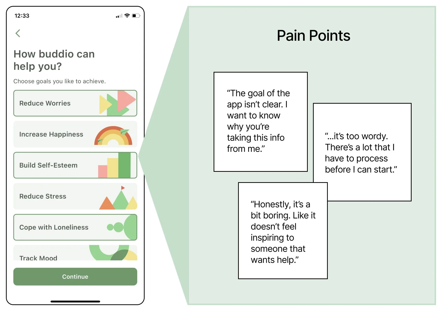
Q: How might we inspire a new user with the promise of a healthcare app without overwhelming them?
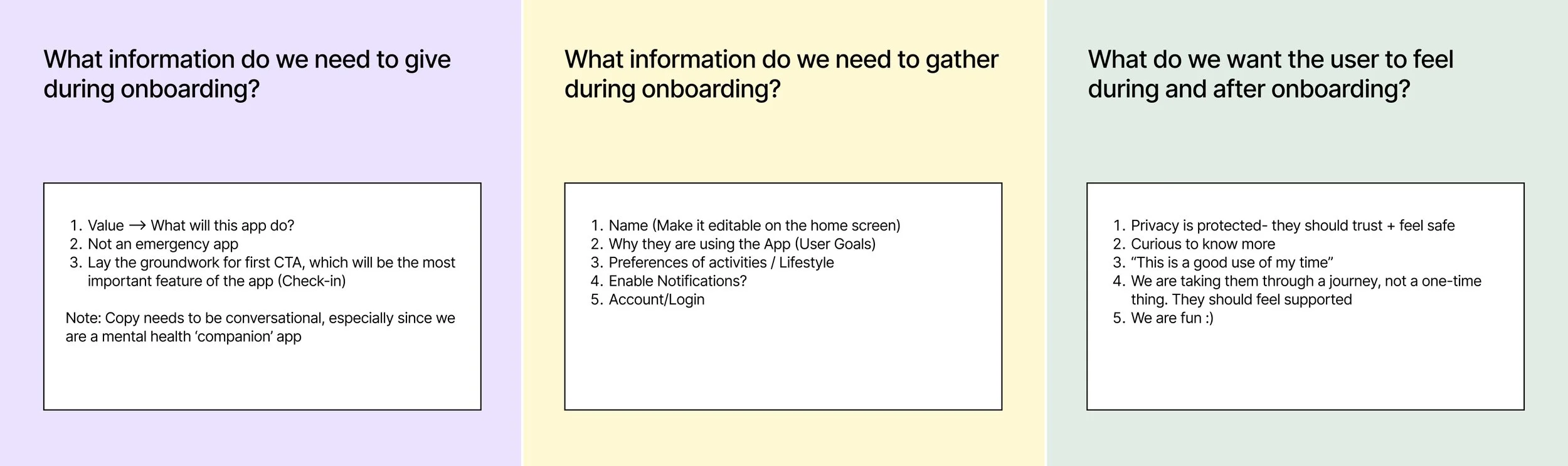
To help us revamp the onboarding flow, we wanted to identify what was necessary to include as part of setting a new user up for success.
We decided to get clear on our goals.

Something that kept coming up in our research was that despite being an app that is a companion in the user’s mental health journey, this app doesn’t feel friendly.
We had a mascot named Nashu in our brand toolkit, but he was heavily underused.
Thus, I decided to design the user flow using Nashu as the guiding entity and experiment with the copy to make it sound like a dialogue between him and the user.

Lo-fi wireframe: 3 variations of the onboarding page that asks the user to rank their favorite types of calming activities.
To help us revamp the onboarding flow, we wanted to identify what was necessary to include as part of setting a new user up for success.
We decided to get clear on our goals.
High fidelity wireframes of the onboarding flow. Wireframes designed on Sketch; illustrations created on Adobe Illustrator.
High fidelity wireframes Version 2, where we prioritized personalization and consolidated the information.
We found that after we implemented these new and improved onboarding screens, our drop-off rate significantly reduced over time.
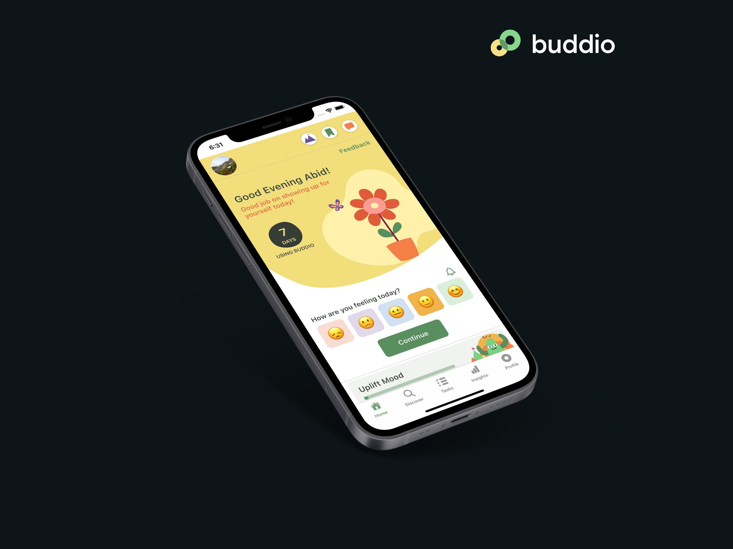
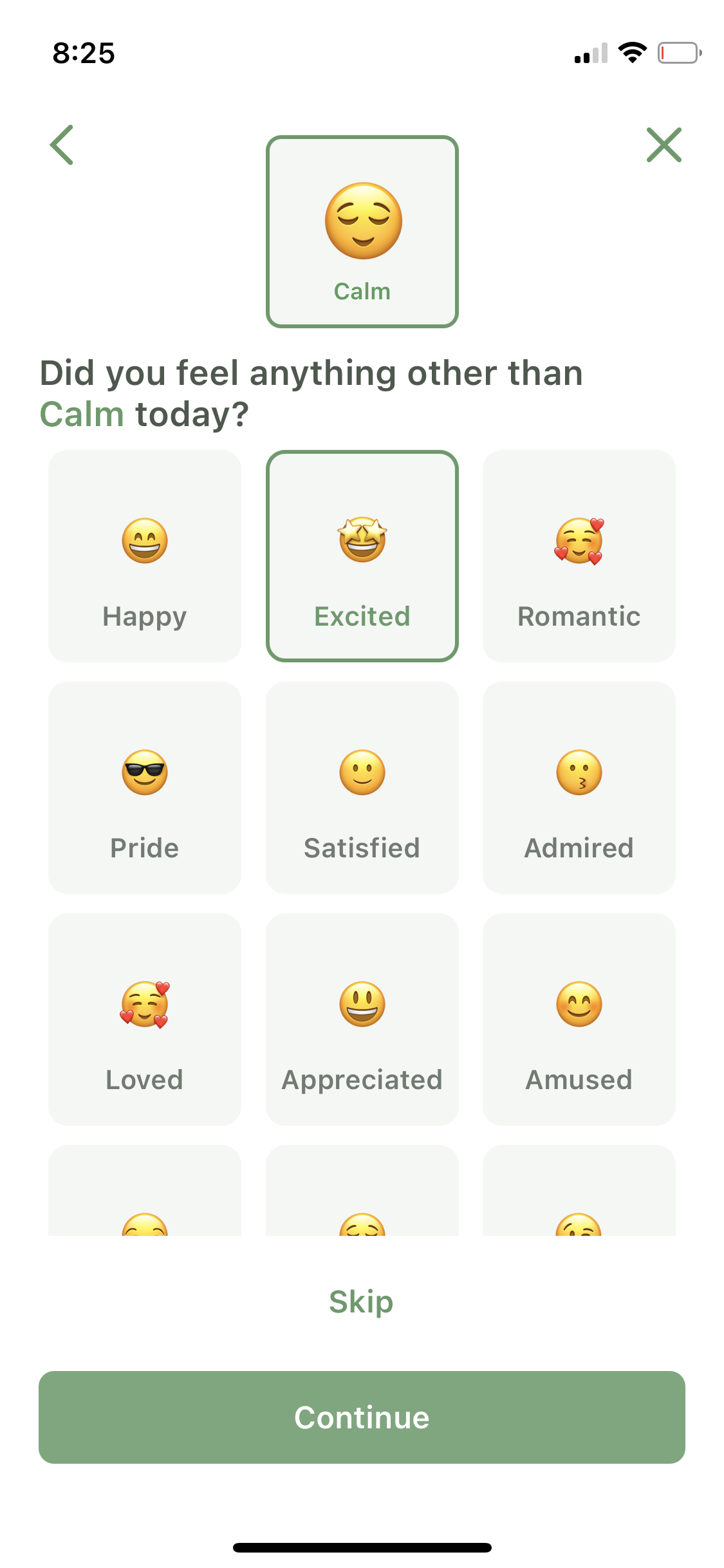
Just asking “How are you?” is not enough.
Challenge
Buddio’s product offering consisted of exercises and activities certified by psychologists to relieve symptoms of anxiety and depression. These were designed by us to be adapted to the format of an app.
The primary exercise was a daily Mood Check-In. This would help users track their mood over time and identify patterns of how their lifestyle and health affected their mood. The retention rate for this feature was low and we set out on a mission to figure out what was wrong.
UXR
Our research began with some competitor analysis. We took an in-depth look at wellness apps in the market and picked 5 market leaders that also had a Mood Check-In feature to understand our threats & opportunities.
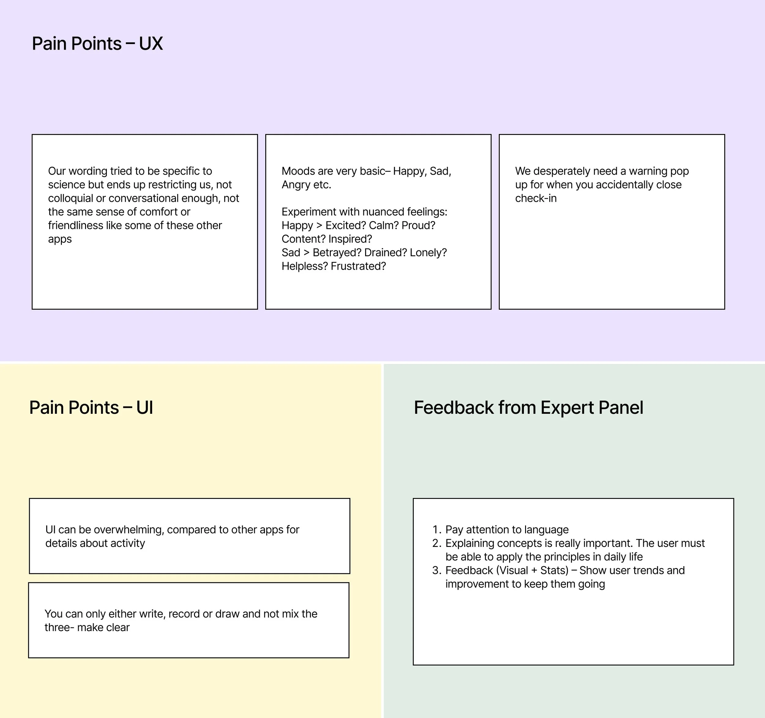
We then conducted expert interviews with the licensed therapists on our panel. We consulted them to identify the weaknesses of our current flow.
Finally, I turned to dogfooding and used the Mood Check-In myself for weeks to analyze it further.

Competitor Analysis - synthesizing various Mood Check-In flows + Idenifying Pain Points in our existing flow.
Identifying Your Mood
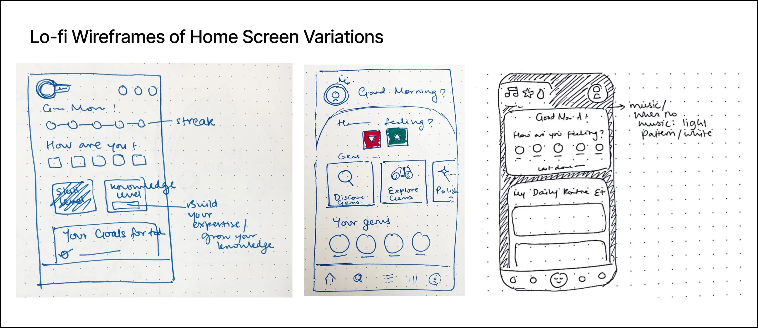
The UXR helped me realize that even recording your mood is a task that could be divided into several steps. The app could help you identify and articulate your mood when you’re not sure what you’re feeling. You could also record a primary and secondary mood at once. I wireframed several concepts and we tested this step of the Mood Check-In.

Gamification
In order to increase the return rate and encourage users to check-in everyday, we researched apps and games that had gone viral, such as Snapchat and Pokemon Go. We wanted to introduce the idea of a “streak”, where the user’s daily interactions would compound over time and earn them rewards.
We thus introduced the concept of a “Gem”. A '“gem” would be an activity such as the Mood Check-In. Doing the activity everyday would be like “polishing your gem”, and the more you polished the gem, the more “shines” you would earn, which you could redeem for extra features.
This was so successful that we applied the gamification strategy app-wide.


UI Variations for stats and insights about Mood Check-In.
UI Variations for success state of completing a Mood Check-In with a streak.
Discoverability
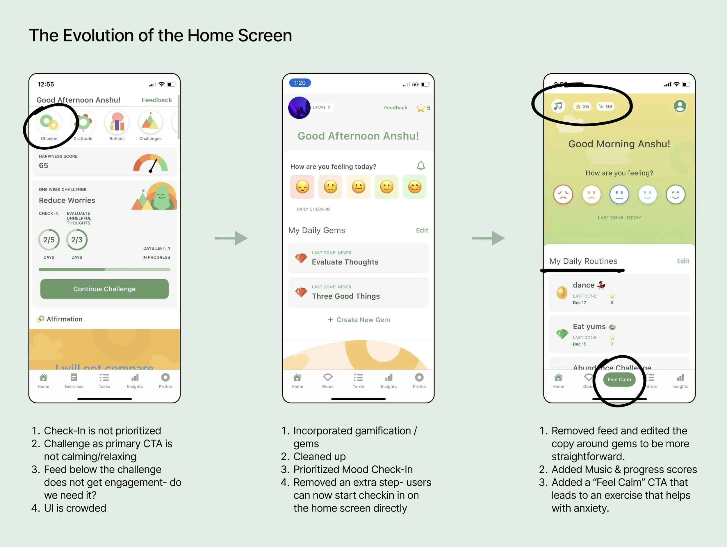
The final element we wanted to tackle for the Mood Check-In was how users would discover this feature on the app.
Initially, all the exercises and activities were lined up as icons up top in a navigation bar. However, we realized that we must guide the user to start a Check-In as soon as they open the app, through a CTA.
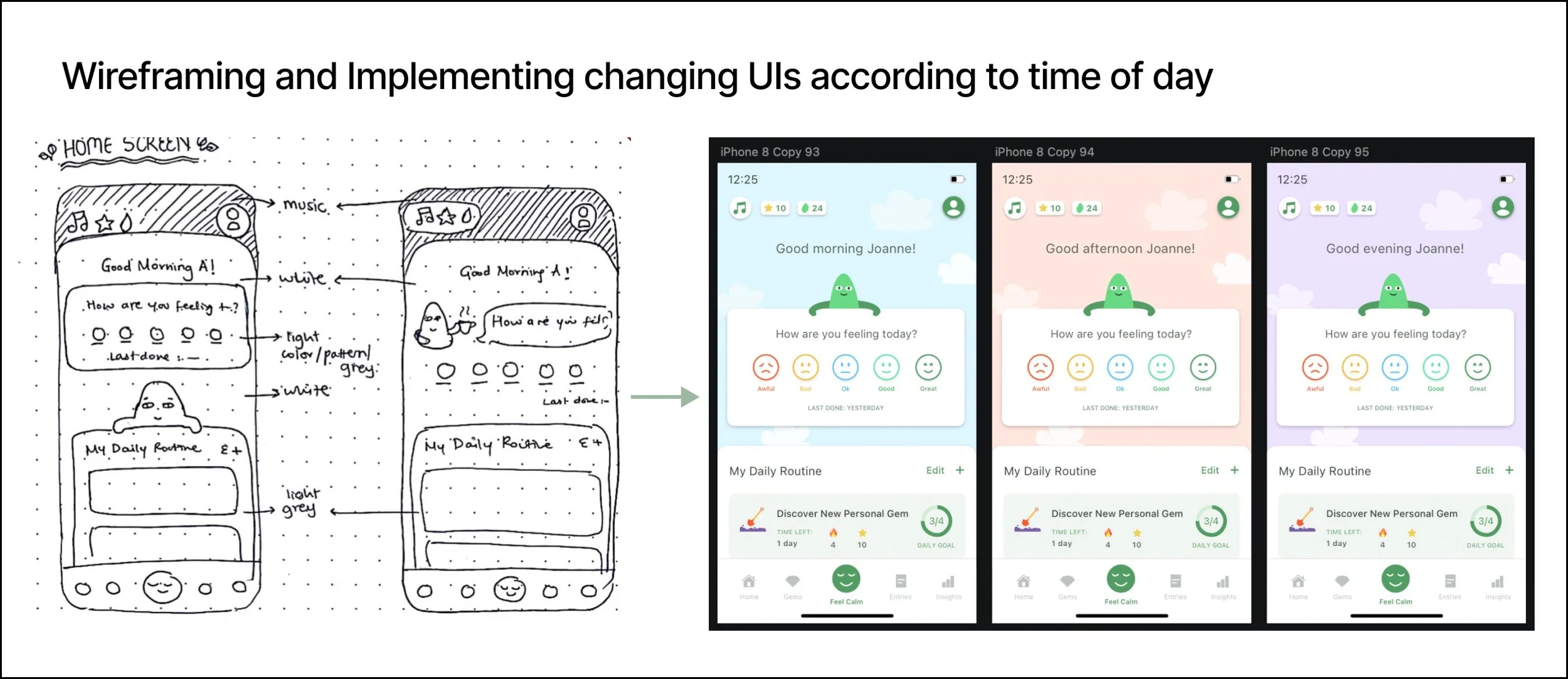
We thus iterated on the home screen layout, removing various UI elements, playing around with prioritization and testing for data.
Demo Video | Founder: Abid Masood, Product Manager: Leslie Rodrigues, UI / UX Designer: Anshu Tukol, Developer: Salman Akram, Brand Identity: Rafay Anwer