

Buddio
Buddio is a mood-tracking and behavioral science-based mental health app. This case study highlights my process for revamping the “mood check-in” feature.
As the sole UX / UI Designer at this startup, I transformed the UX by streamlining user flows and designing delightful user interfaces for various product features.

Buddio home screen designed by Anshu Tukol.
Just asking “How are you?” is not enough.
The Solution
After conducting in-depth dogfooding exercises, competitor analyses, intense sketching and a lot of iterative prototyping, we came up with a Gamification Strategy to engage the user and stop them from dropping off a crucial feature.
As a result, our user engagement went up by 62%.


Team
Founder: Abid Masood
UX / UI: Anshu Tukol
Project Manager: Leslie Rodrigues
Developer: Salman Akram
Brand: Rafay Anwer
My Role
UX Research
Wireframing
UI Design
Prototyping
Updating Design System
Tenure at Buddio
Aug 2021 – Feb 2022
The Challenge
The “mood check-in” feature helped users track their mood over time and identify patterns between lifestyle, behaviors and mental wellbeing. However, the retention rate for this feature was low. Users were not being consistent with checking in and we set out on a mission to figure out what was wrong.
The Process:
Tools
Sketch
Figma
Adobe Illustrator
Trello
Initial Hypothesis
We assumed that the current mood check-in flow was too long and verbose, and that was why users were quitting the screen somewhere midway. We also felt that it was not joyous or delightful enough, especially for a tool dealing with difficult feelings.
Discovery Phase I
My research began with some competitor analysis. I took an in-depth look at wellness apps in the market and picked 5 market leaders that also had a Mood Check-In feature to understand our threats & opportunities.
2 main takeaways:
Many apps give users more autonomy, including space to personalize the check-in
Education about CBT needs to be made accessible through check-in.
Discovery Phase II
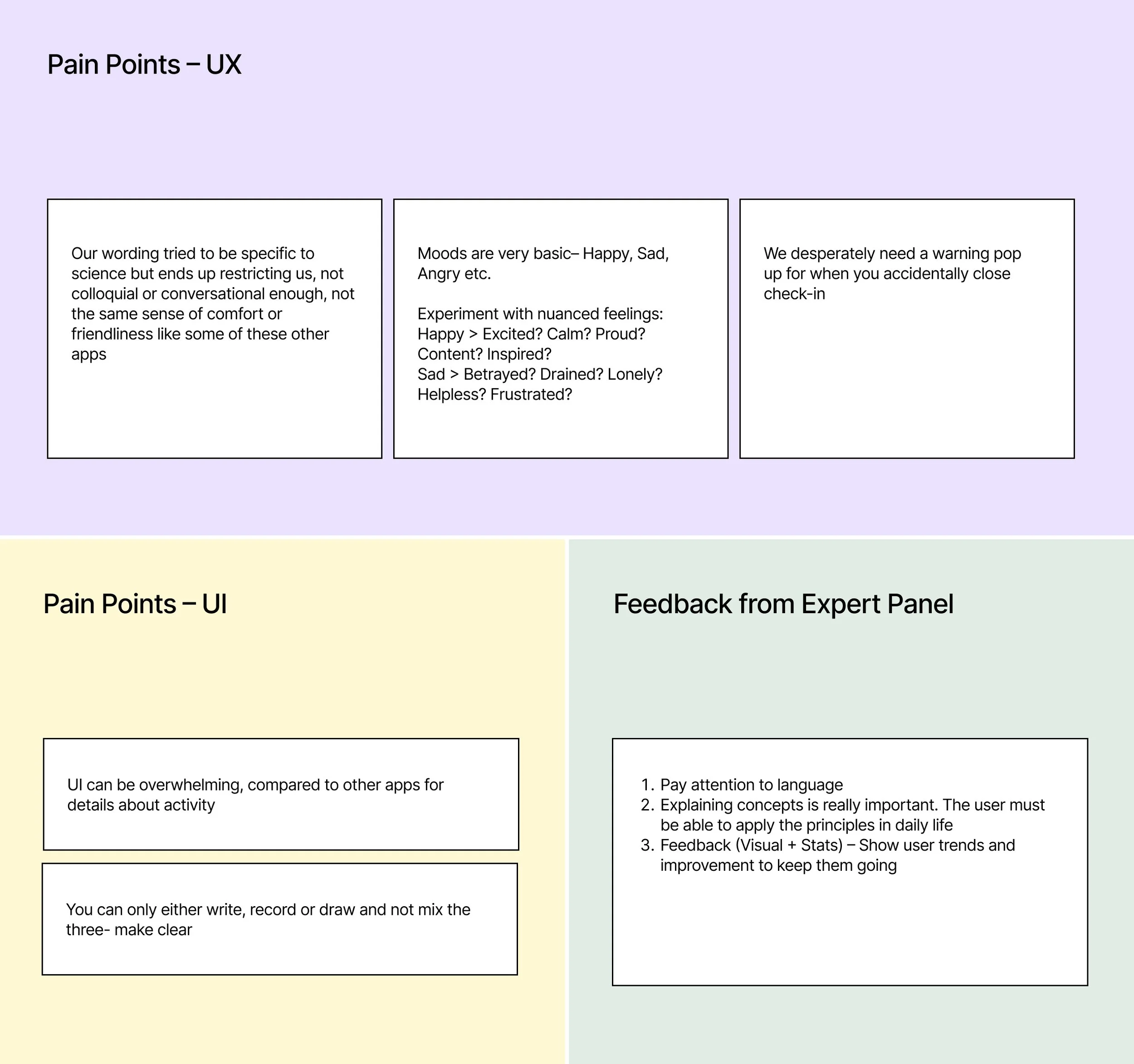
We then conducted expert interviews with the licensed therapists on our panel. We consulted them to identify the weaknesses of our current flow.
Discovery Phase III
I turned to dogfooding and used the Mood Check-In myself consistently for weeks to analyze it further.
Takeaways from further research
Discovery Phase IV
I conducted usability testing with our existing flow to gain nuanced insight. I watched where users hesitated, got confused, and tracked their emotional responses.

“(while selecting mood)...I am not sad, but I’m also not happy. I’m somewhere in between.”
“I try to take a deep breath but it doesn’t help. Unfortunately I still haven’t found activities that help.”
“I can see that going for a walk everyday would help my mood but I have no motivation or anyone to keep me accountable.”

Stress Relievers

Playing with her cat Momo

Video calling her best friend

Going for a yoga class
User Persona example:
Claire Li
Data Analyst, 24
Based in Seattle, Washington
Overview
Claire is stressed out by her busy schedule, and sometimes finds herself waking up anxious in the morning. She speaks with a therapist once in two weeks, which helps, but wants to develop a more mindful daily routine. She is an extrovert and enjoys going to yoga classes.
Why does she use Buddio?
Her therapist suggested that she journal every day. But it is difficult for her to keep up a daily practice, and she wants a similar activity, that gives her the depth of journaling with a low barrier to entry. She also wants a tailored mindfulness routine according to her lifestyle and interests.
Pain Points

Faces daily stress and anxiety, and hasn’t found a sustainable way to address it
Knows journaling and checking in would help but can’t be consistent


Forgets learnings from therapy and doesn’t know how to apply them / feels lonely doing it herself
Q: How might we make the mood check-in more empathetic to the complex human experience, and help users be consistent with tracking their improvement?
Solutions Overview
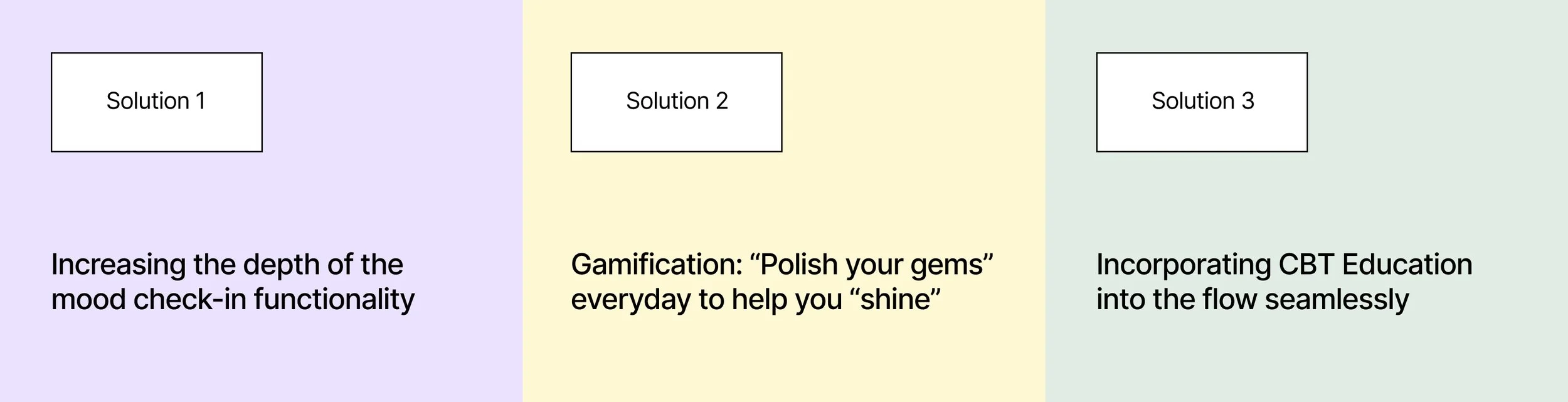
A Deeper Dive…
Final Deliverable
We didn’t stop there.
We kept iterating, for example…
We took the test results we received for solution #3, and improved the flow.
Instead of having a crowded screen with a diagram stuck on it, we simplified the screen
We allowed the information architecture to do the teaching. We removed the hierarchy of the flow and users could record their feelings, actions and thoughts in any order, teaching them that intercepting in one area affects the others and the order does not matter.
We further incorporated the gamification strategy. If an action made you feel better about a situation, you could add it to your list of gems, your personal toolkit to empower yourself.
BEFORE
AFTER

The Impact: Our user engagement went up by 62%.
Source: Google Analytics
Key Learnings
Our initial hypothesis (if you remember!) was that the flow was too long. Our research and iterative testing showed us that this was wrong. The new and improved flow was longer that the original, but it was more intentional, nuanced, and served the needs of the user better.
We were able to balance business and user needs, but with this particular project I learned that by focusing on our user’s needs, we were simultaneously solving for business needs.
If I had more time and less constraints, I would improve the UIs further. I would add more modern elements to the design system and change the screens to reflect trendy design, as our target users are in their early 20s.